The world-leading data visualisation tool
Tableau has been a leading visualisation tool in the Gartner BI & Analytics Magic Quadrant for five consecutive years.
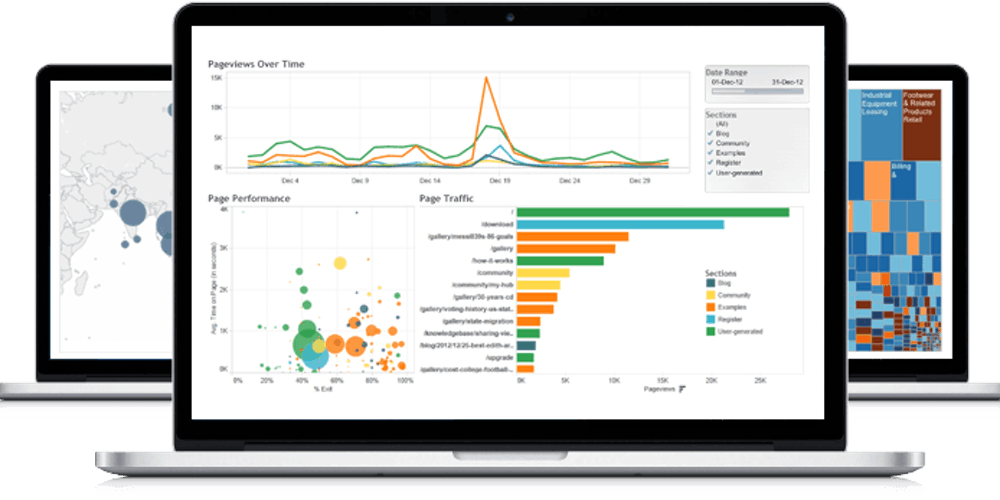
This comes as no surprise, given its easy to use drag-and-drop functionality and the speed at which it allows users to see and understand their data.
At Field Dynamics, we began using Tableau as part of our client projects. We saw value in how quickly complex data sets could be translated into meaningful visualisations. We are now an official Tableau Partner.
Who uses Tableau?
How can Tableau improve field efficiency?
Field-based organisations are complex. There are streams of data coming in from every department, and this often means that opportunities for insight are missed.
These are 3 ways we believe that Tableau can help you understand your field operation.
Speed
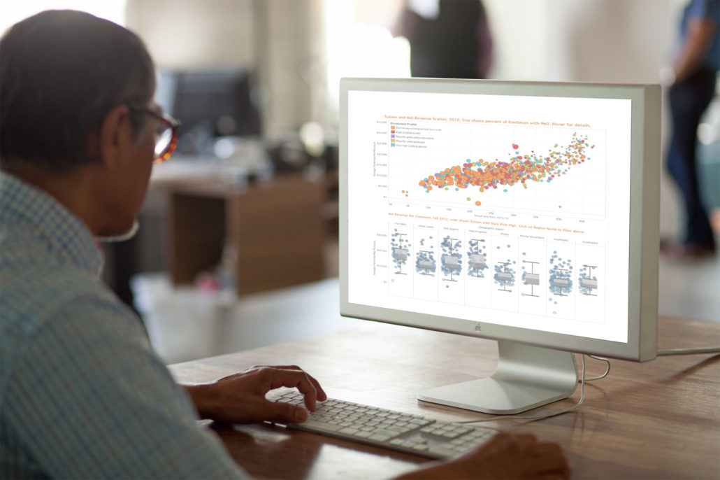
Some of our clients have missed out on insights because pulling the data into the right format – be it a graph or a map – just takes too long and requires a number of people. Tableau streams from over 30 data sources, making the speed to insight even faster.
Depth
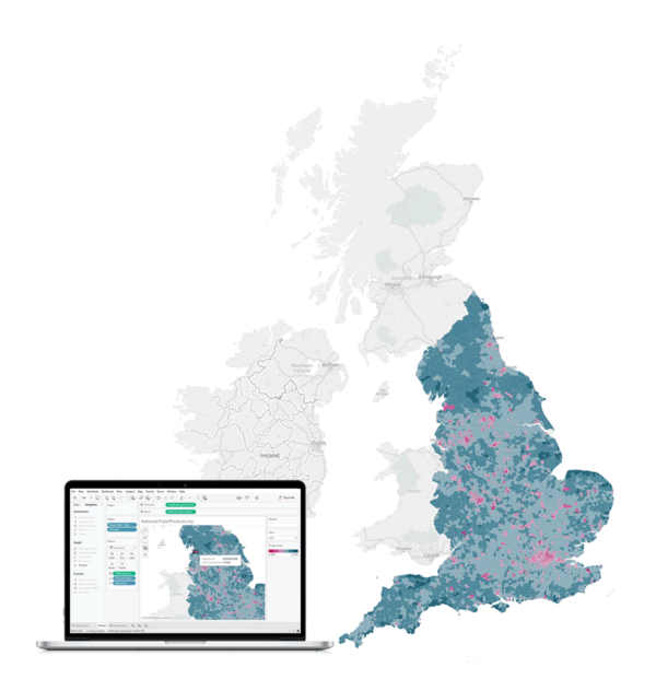
The complexity of field operations means that static visualisations don’t always work well. The interactive dashboards that can be made in Tableau mean that you can delve in and out of the data whenever you need. For example, you can map national performance and then quickly click into the map to display performance on a regional basis. If needed, you can even dig into the data to display metrics by team or individual – all within the same visualisation.
Sharing
Tableau allows you to easily share your analysis across your organisation. This can reduce the duplication of work and allows each viewer to investigate efficiency or team behaviours at a relevant level. When required, you can also add privacy features and passwords to restrict access to particular dashboards.
